Introduction
This guide explains how to calculate the mean and standard deviation of behavioral data collected over four minutes and how to create a simple chart in Excel to visualize these values.
Calculating Mean and Standard Deviation in Excel
- Mean Calculation: Use the formula
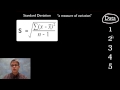
=AVERAGE(range)where you highlight your data set within the parentheses. - Standard Deviation Calculation: Use the formula
=STDEV(range)similarly by highlighting the data range. For a deeper understanding of standard deviation, you can refer to Understanding and Calculating Standard Deviation in Science Labs. - Drag the formulas across your data columns to calculate means and standard deviations for all categories.
Preparing Data for Charting
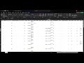
- To simplify chart creation, transpose your data from horizontal to vertical:
- Copy the original data.
- Use "Paste Special" and select "Transpose" to paste the data vertically.
- Repeat the transpose process for the mean and standard deviation values, ensuring you paste values only (not formulas).
Creating the Chart
- Highlight the mean values and insert a column chart via the Insert tab.
- Add category labels:
- Right-click the chart and select "Select Data."
- Edit the Horizontal (Category) Axis Labels by selecting the behavior category names.
Adding Error Bars for Standard Deviation
- Click on the chart bars and go to the Layout tab.
- Select "Error Bars" > "More Error Bars Options."
- Choose "Custom" and specify the standard deviation range for the error values.
- Adjust error bars to show only the positive direction for a cleaner look.
Finalizing the Chart
- Remove unnecessary series captions.
- Add axis titles:
- Horizontal axis: "Observed Behaviors"
- Vertical axis: "Number of Fish per Minute" (rotated vertically)
Practical Tips
- Use this method to summarize data from multiple samples or combined datasets. For more on data manipulation in Excel, check out Mastering Basic Navigation and Data Manipulation in Microsoft Excel for Survey Analysis.
- Calculating grand means and standard deviations helps in comparing data clearly.
- Visual summaries like these charts make large datasets easier to interpret and present. For additional insights on data visualization, see Mastering Descriptive Statistics in Excel: A Step-by-Step Guide.
Conclusion
By following these steps, you can efficiently analyze behavioral data and create professional charts in Excel that clearly communicate your findings. This approach is useful for research, presentations, and data reporting. For further exploration of data analysis techniques, consider Analyzing Data with Cross Tabulation in Microsoft Excel and Understanding Correlation Techniques: Pearson, Spearman, Phi Coefficient, and Point Biserial.
okay today I'm going to go through how to calculate the mean and standard de deviation and uh make a simple chart uh
demonstrating the values so what we have here is uh the observations over four minute just four minutes for an of for
an example of of some scan sampling for uh the number of fish that are performing an
activity so what we have are our four Behavior categories in in four minutes so first I'm going to show how to
calculate the mean the mean's very simple to do it's just a simple formula equals
average parenthesis highlight your data set with end
parenthesis then go down and that calculates that similarly you can calculate standard deviation the same
way equals stde parenthesis highlight the data you want
to calculate the standard deviation from and hit the parenthesis again and then go down below and it calculates it now
simply dra copy this and drag this formula across to calculate these values for everything next we want to do is
actually make a graph so what we're going to do is actually uh we could do it in the with the data in this format
like this but but it's simpler to just transpose the data so we'll copy it then we're going to paste it down
here and we're going to use paste special okay and this will trans and then we'll use transpose and that'll put
reverse these things into a vertical column next we'll copy the mean data oops place that down there by
transposing it using this P special but we have to click click values or it will copy the
formulas and we'll do the same with the standard deviations pay special values again so
we copied the the values and transpose so now we have our data into a format that we can make into a a chart very
easily so we first highlight the uh mean values uh for this data and we hit insert
column like that so we have our our basic graph now what we want to do is assign the um names of these these
categories so to do this we need to click on one of these uh charts oop sorry right click on and you'll see here
when you right click the mouse that you're going to see select dat data and so you'll choose that so now you'll hit
edit in the horizontal category AIS labels we'll hit edit now we're going to select the label range by clicking on
this little box here and highlight those that titles now when we click this little box again this will uh insert
these in so now we have the labels on on our our graph the next thing we want to do is click on on these um little charts
these little bars and we'll hit layout and this will allow us to insert in error bars so this will be the the
standard deviations that that we have here so let's click on Arrow bars and you'll see more Arrow bars options
that's where we want to go with this so we hit more Arrow bar options and we tell it that we want to use a custom
value and now we're going to specify the data range for that okay so we specify value and what we're going to do is
highlight those standard deviations we calculated okay then once we do that we just hit okay and now our standard
deviations are are now in this uh in this data now one of the things you might want to do to make your standard
deviations look a little nicer is uh when you uh click on these standard deviations is actually just have them as
plus so they don't go downward just upward so now they look a little bit nicer next thing you want to do is is
clean this up a bit get rid of this series caption um you want to insert your uh your axis
titles so the first one is primary horizontal axis title idle AIS below okay so this is all under that
that layout tab so now we just type in what this is and we see type in observed
behaviors okay next we'll insert the axis title for the vertical one we do a a primary vertical axis this time and we
rotate it and what we want to do is is uh call this um
numbers of fish per
minute okay and now we have a a the uh axis done so that essentially is all we have to do in order to to create a graph
and Excel that will allow us to compare our data so you could do this with INF fish or you can take the grand means of
your all your samples yours and your partner's data and and calculate the means and standard deviation for your
combined data so in other words calculate the tallies for each uh sampling that you did uh and then and
then take the means for each one of those and then calculate standard deviation and means for the combined
data and uh then create your graphs and you want to do this uh as a way to summarize your data rather than having
lots and lots of data but instead having it summarized in nice graphs that are easy to understand and clear to read
thank you hope that helps
To calculate the mean in Excel, use the formula =AVERAGE(range), where 'range' is the set of cells containing your data. Simply highlight the data set you want to analyze and place it within the parentheses.
In Excel, you can calculate standard deviation using the formula =STDEV(range). Highlight the range of data you wish to analyze, and this formula will provide you with the standard deviation for that dataset.
To create a chart in Excel, first highlight the mean values you want to visualize. Then, go to the Insert tab and select a column chart. You can further customize the chart by adding category labels and adjusting the layout.
To transpose data in Excel, first copy the original data. Then, right-click on the cell where you want to paste it, select 'Paste Special', and choose 'Transpose'. This will switch your data from horizontal to vertical format.
To add error bars in Excel, click on the chart bars, go to the Layout tab, and select 'Error Bars' followed by 'More Error Bars Options'. Choose 'Custom' and specify the standard deviation range for the error values to enhance your chart's clarity.
Calculating grand means and standard deviations is crucial for comparing data across multiple samples or datasets. This helps in identifying trends and making informed decisions based on the summarized data.
When summarizing data in Excel, consider using charts for visual representation, and ensure to clean up your data by removing unnecessary series captions. Additionally, using transposed data can simplify the chart creation process.
Heads up!
This summary and transcript were automatically generated using AI with the Free YouTube Transcript Summary Tool by LunaNotes.
Generate a summary for freeRelated Summaries
Understanding and Calculating Standard Deviation in Science Labs
This video explains the concept of standard deviation, its importance in data analysis, and how to calculate it both manually and using a spreadsheet. Learn how standard deviation measures data spread around the mean and see step-by-step examples for practical understanding.
Mastering Descriptive Statistics in Excel: A Step-by-Step Guide
In this tutorial, learn how to analyze single variables in Microsoft Excel using pivot tables. Discover how to count responses, calculate percentages, and compute averages and medians for effective data analysis.

Comprehensive Guide to Data Analysis and Visualization in MS Excel
Explore a complete tutorial on using MS Excel for data analysis and visualization, covering essential features like Power Query, Power Pivot, formulas, conditional formatting, pivot tables, charts, and dashboard creation. Learn data cleaning, transformation, and insightful visualization techniques from basics to advanced level.
Mastering Basic Navigation and Data Manipulation in Microsoft Excel for Survey Analysis
In this video, we explore essential navigation and manipulation skills in Microsoft Excel, specifically for analyzing survey data. Learn how to identify rows and columns, manage headers, sort data, and handle different types of survey responses effectively.

Master Excel for Data Analysis: From Basics to Interactive Dashboards
Learn Microsoft Excel for data analysis starting from the basics to advanced features like formulas, pivot tables, and Power Query. This comprehensive guide covers data cleaning, dynamic filtering, advanced lookup functions, and building interactive dashboards for real-world business insights.
Most Viewed Summaries

A Comprehensive Guide to Using Stable Diffusion Forge UI
Explore the Stable Diffusion Forge UI, customizable settings, models, and more to enhance your image generation experience.

Kolonyalismo at Imperyalismo: Ang Kasaysayan ng Pagsakop sa Pilipinas
Tuklasin ang kasaysayan ng kolonyalismo at imperyalismo sa Pilipinas sa pamamagitan ni Ferdinand Magellan.

Mastering Inpainting with Stable Diffusion: Fix Mistakes and Enhance Your Images
Learn to fix mistakes and enhance images with Stable Diffusion's inpainting features effectively.

Pamamaraan at Patakarang Kolonyal ng mga Espanyol sa Pilipinas
Tuklasin ang mga pamamaraan at patakaran ng mga Espanyol sa Pilipinas, at ang epekto nito sa mga Pilipino.

How to Install and Configure Forge: A New Stable Diffusion Web UI
Learn to install and configure the new Forge web UI for Stable Diffusion, with tips on models and settings.

If you found this summary useful, consider buying us a coffee. It would help us a lot!