Introduction to Descriptive Statistics in Excel
Welcome to this tutorial on analyzing data using Microsoft Excel. In this video, we focus on descriptive statistics, specifically how to extract information about single variables using pivot tables.
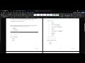
Creating a Pivot Table
- Insert Pivot Table: Go to the Insert tab and select the Pivot Table option.
- Select Data Range: Choose the range of data you want to analyze, such as survey responses.
- Choose Location: Decide whether to place the pivot table in the current worksheet or a new one. A new worksheet is often cleaner.
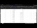
Analyzing a Variable
- Drag Variable to Rows: For example, drag the variable "Are you a freshman?" into the rows box.
- Add to Values: Drag the same variable into the values box to count responses.
- Change to Count: By default, Excel may sum the values. Change this to count by selecting "Value Field Settings" and choosing "Count".
Calculating Percentages
- Right-Click for Percentages: Right-click on the count cells, select "Show Values As", and choose "Percent of Column Total" to display percentages instead of counts.
Filtering Responses
- Adjust Displayed Data: Use the row labels arrow to include or exclude specific responses, such as only showing freshmen.
Displaying Counts and Percentages Together
- Add Another Entry: You can drag the variable into the values box again to show both counts and percentages. Remember to change the second entry to count.
Labeling Responses
- Clarify Data: Label the responses (e.g., 1 = Yes, 2 = No) for better readability.
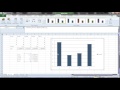
Calculating Averages and Medians
- Using Formulas: To calculate averages, use the formula
=AVERAGE(range). For medians, use=MEDIAN(range). This allows you to summarize numerical data effectively. For more advanced operations using formulas and functions, check out our guide on Mastering Excel 2019: Perform Operations Using Formulas and Functions.
Conclusion
This tutorial covered the basics of obtaining descriptive statistics for single variables in Excel. In the next video, we will explore cross-tabulation to compare two variables. If you're interested in learning more about data manipulation techniques, consider reviewing Mastering Basic Navigation and Data Manipulation in Microsoft Excel for Survey Analysis. Additionally, for those looking to analyze data using Python, our summary on Python Pandas Basics: A Comprehensive Guide for Data Analysis may be beneficial.
hello hello hello and welcome to your continuing video tutorial series all about analyzing data using Microsoft
Excel in this video I'm going to cover descriptives which is how you get information about single
variables now we've talked about multiple different types of variables but I'm just going to focus on a single
Choice option here like our are we a freshman question in order to do descriptives the
simplest and easiest way is to use what's called a pivot table in Microsoft Excel we get a pivot table by clicking
the insert Tab and selecting this very first option pivot table it's going to give you a little
bit of popup and there's two things we need to do with it the first is to select the range or the data that we
want the pivot table to be able to pull from so in this case we want our survey questions
when you have table range selected you can just drag and select across your whole Microsoft Excel spreadsheet to
include everything so that's your range you can also say whether or not you want the
pivot table to appear here on this spreadsheet along with your data or on a new worksheet I'm going to send it to a
new worksheet CU I think it looks cleaner um but you could certainly leave it here especially if you've got a lot
of computer screen real estate that can be convenient so I'm going to click okay it's going to make a new worksheet and
it will have this weird blank pivot table here and then on the right it will have opened this thing called pivot
table fields and it'll have a list of your variables
here I'm going to analyze this are you a freshman question in order to do that I need to tell it that this is the
variable I want to use and so I'm going to click and drag are you a freshman down to this rose box
so now Excel knows that we have are you a freshman is going to appear in the rows
of this table but it doesn't show us any data yet and that's because we haven't told it what data we want it to be
accounting for we really just want to learn about how many students are freshman and how many students are not a
freshman so we're going to drag are you a freshman into the values box as well this says display me the number for this
variable okay unfortunately Microsoft Excel does not automatically assume that you're a
statistici um and because of that it sometimes defaults to having your variable set as a sum so really what
it's doing is it's adding up all the ones and twos and giving you totals we don't want that what we want is a count
and so the way we switch this to count is you you see it says under this values box it says sum of are you a freshman
we're going to click that and we're going to change the value field settings uh in this little menu here
okay and so the second option is count count is what we want we want to know how many people answered one and how
many people answered two that's counting so select count and click okay and now you've
got a count of how many people selected a one and how many people selected a two the next step is to figure out how
we can get percentages out of this table you may remember from class that counts are not necessarily very
informative percentages are often times much better because it allows us to think about how many
individuals uh in terms of proportion question s answered in each particular way that's often easier to interpret
otherwise you find yourself kind of doing math in your head nobody wants that so how do we get percentages well
the easy way to do it is to click any either one of these cells where our values are displayed and we're going to
right click we're going to go down to this show values
as and we're going to select percent of column total because we want this column this count to add up to 100% here so
we're going to go ahead and click percent of column total and now you have
percentages okay the other thing that we might want to manipulate though it's not so
relevant here is maybe there are response options that are listed here that we're not so interested in say for
example there was one person who had a missing response we might have a whole another row dedicated to who was missing
who didn't give an answer if we wanted to change what gets displayed maybe we only wanted to know
about the uh the folks who said or answered one to are you a freshman we can click this arrow on the row labels
and we can select what gets included and what does not get included so let's say I only wanted one to appear I can
uncheck two and now the table only includes one but of course it adds up to 100% so that's not terribly informative
we want the whole group okay we can also get both counts and percentages in the same table as we if
we want we can just drag are you a freshman into values again we can add a whole another entry and again it's
counted as a sum we got to change that back to account no problem and now we can see both the
counts and percentages for these answers the last thing that we might want to do to make this easily readable is to
label what is one and two so we go back to our code book real quick and we say oh are you a freshman one means yes and
two means no so one means freshman two means upper classmen so I can just type into these boxes
and now I have a clear label that makes this very very easy to read okay the other form of descriptive
information that you could possibly need is something like an average or a median and in this particular survey
they had a variable that could be measured anywhere from 0 to 100 and so we can calculate an average quite
easily to calculate an average all we need to do is create a minor Microsoft Excel
formula so the way that we do that is with the equal sign so I'm going to click any cell any cell I want I'm going
to pick this one and I'm going to use the equal sign first which is
Microsoft cell's immediate code that says hey we're going to compute a formula in this
cell and I'm going to type in average which is the command I want it to do I'm going to open parentheses and I'm going
to go ahead and drag and select all of the cells I would like it to average together these are the cells I want you
to average and then I'm going to close that parenthesis and hit enter and that's the average value across this
whole variable you can do the same thing with a median you can say equals
median open parentheses and select this value select all the values that are relevant and now you know that the
median score is 40 so these are ways that you can get basic descriptive information about
single variables in the next video we will look at Cross tabulation and how we might
compare two variables together
Yes, you can display both counts and percentages in the same pivot table. Simply drag the variable into the 'Values' box again, change the second entry to 'Count,' and you will have both counts and percentages side by side.
Descriptive statistics summarize and describe the main features of a dataset, providing insights into single variables. They are important because they help in understanding the data's distribution, central tendency, and variability, making it easier to interpret and communicate findings.
To create a pivot table in Excel, click on the 'Insert' tab and select 'Pivot Table.' Choose the data range you want to analyze and decide whether to place the pivot table in the same worksheet or a new one. This allows you to organize and summarize your data effectively.
After dragging your variable into the 'Values' box of the pivot table, you may need to change the default setting from 'Sum' to 'Count.' Click on the value field settings and select 'Count' to see how many respondents selected each option.
To calculate percentages in a pivot table, right-click on any cell with the count values, select 'Show Values As,' and then choose 'Percent of Column Total.' This will convert the counts into percentages, making it easier to interpret the data.
To label response options in a pivot table, you can manually edit the labels in the pivot table fields. For example, if '1' represents 'Freshman' and '2' represents 'Upperclassman,' you can type these descriptions directly into the pivot table to make it more readable.
In Excel, you can calculate averages using the formula '=AVERAGE(range)' and medians using '=MEDIAN(range).' Replace 'range' with the actual cell range you want to analyze. This allows you to quickly find the average and median values of your data.
Heads up!
This summary and transcript were automatically generated using AI with the Free YouTube Transcript Summary Tool by LunaNotes.
Generate a summary for freeRelated Summaries
Analyzing Data with Cross Tabulation in Microsoft Excel
In this video, we explore how to compare two variables using cross tabulation in Microsoft Excel through pivot tables. The tutorial covers setting up pivot tables, interpreting results, and visualizing data effectively.
Mastering Basic Navigation and Data Manipulation in Microsoft Excel for Survey Analysis
In this video, we explore essential navigation and manipulation skills in Microsoft Excel, specifically for analyzing survey data. Learn how to identify rows and columns, manage headers, sort data, and handle different types of survey responses effectively.

Comprehensive Guide to Data Analysis and Visualization in MS Excel
Explore a complete tutorial on using MS Excel for data analysis and visualization, covering essential features like Power Query, Power Pivot, formulas, conditional formatting, pivot tables, charts, and dashboard creation. Learn data cleaning, transformation, and insightful visualization techniques from basics to advanced level.

Master Excel for Data Analysis: From Basics to Interactive Dashboards
Learn Microsoft Excel for data analysis starting from the basics to advanced features like formulas, pivot tables, and Power Query. This comprehensive guide covers data cleaning, dynamic filtering, advanced lookup functions, and building interactive dashboards for real-world business insights.
How to Calculate Mean, Standard Deviation, and Create Charts in Excel
Learn step-by-step how to calculate the mean and standard deviation for behavioral data in Excel and create clear, informative charts with error bars. This guide simplifies data analysis and visualization for better understanding and presentation of your results.
Most Viewed Summaries

A Comprehensive Guide to Using Stable Diffusion Forge UI
Explore the Stable Diffusion Forge UI, customizable settings, models, and more to enhance your image generation experience.

Kolonyalismo at Imperyalismo: Ang Kasaysayan ng Pagsakop sa Pilipinas
Tuklasin ang kasaysayan ng kolonyalismo at imperyalismo sa Pilipinas sa pamamagitan ni Ferdinand Magellan.

Mastering Inpainting with Stable Diffusion: Fix Mistakes and Enhance Your Images
Learn to fix mistakes and enhance images with Stable Diffusion's inpainting features effectively.

Pamamaraan at Patakarang Kolonyal ng mga Espanyol sa Pilipinas
Tuklasin ang mga pamamaraan at patakaran ng mga Espanyol sa Pilipinas, at ang epekto nito sa mga Pilipino.

How to Install and Configure Forge: A New Stable Diffusion Web UI
Learn to install and configure the new Forge web UI for Stable Diffusion, with tips on models and settings.

If you found this summary useful, consider buying us a coffee. It would help us a lot!