Analyzing Data with Cross Tabulation in Microsoft Excel
Overview
In this video, we explore how to compare two variables using cross tabulation in Microsoft Excel through pivot tables. The tutorial covers setting up pivot tables, interpreting results, and visualizing data effectively.
Key Steps in Cross Tabulation
-
Creating a Pivot Table:
- Navigate to the Insert tab and create a new pivot table.
- Set the range to include all variables for analysis.
-
Setting Up Variables:
- Place the independent variable (e.g., "Are you a freshman?") in the columns.
- Place the dependent variable (e.g., "Have you declared a major?") in the rows.
-
Counting Values:
- Drag the dependent variable into the values section and change the setting from sum to count.
-
Calculating Percentages:
- Right-click on a cell, select "Show Values As," and choose "Percent of Column Total" to interpret the data more effectively.
-
Labeling and Formatting:
- Label columns and rows for clarity.
- Clean up the table by removing unnecessary elements and adjusting formatting for presentation.
Comparing Averages
- To compare averages across groups, create another pivot table.
- Drag the independent variable into the rows and a numerical variable (e.g., financial aid) into the values section, setting it to average. For more detailed guidance on data manipulation, check out our summary on Mastering Basic Navigation and Data Manipulation in Microsoft Excel for Survey Analysis.
Visualization Recommendations
- For better visual representation, transfer the percentages from Excel into presentation software like Canva, PowerPoint, or Google Slides to create professional-looking charts. You can also learn about effective data visualization techniques in our summary on Mastering Descriptive Statistics in Excel: A Step-by-Step Guide.
Conclusion
This tutorial provides a comprehensive guide to using cross tabulation in Excel for data analysis, emphasizing the importance of clear presentation and effective visualization. For further insights into data analysis techniques, consider exploring Understanding Correlation Techniques: Pearson, Spearman, Phi Coefficient, and Point Biserial.
hello hello hello and welcome to your continuing video lecture series all about analyzing your data using
Microsoft Excel in this video we are going to tackle comparing two variables against each other most of the time we
will be using cross tabulation in order to accomplish that cross tabulation is done using a
pivot table just like our descriptive statistics were done so let's do
it I'm going to go to my insert tab just like I've done before and create a new pivot table I'm going to put that on a
new worksheet and I'm going to set my range as again my whole table with all of my variables so I can
pull on any of them that I want okay and then I'm going to click okay and now I've got my new pivot
table in this case I want to analyze two variables are you a freshman and have you declared a major now this is
probably a not very interesting question the vast majority of freshmen should not have declared their major yet so this
should produce a pretty straightforward and strong relationship no problems there we'll use
that just for the demo for convenience sake now I want you to remember a little rule here
in order to create tables that are really easily interpreted we want to put our
independent variable in the columns and we want to put our dependent variable in the rows in this case that means we
think whether you're freshman or upper class that should be what predicts whether or not you have declared your
major that means that are you a fresh that question that should be our independent
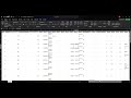
variable have you declared a major becomes our dependent variable so that means that freshman needs to go into the
columns and major declaration needs to go into the rows so I'm going to drag are you a
freshman into the columns box in my pivot table fields and you can see now I have
columns and I'm going to drag have you declared a major into the rows and so now I have rows and
columns and then I'm going to drag have you declared a major again into values because I want the dependent
variable to be the numbers that we see okay and so here's what we get we get a sum so we got to fix that real quick so
a sum of have you declared a major no no no we want to count I'm going to switch that to count real quick
Bingo now we have the basic foundations of a cross tabulation but remember we usually want to compare percentages and
that's because the grand totals or well the totals of these uh of each column are different and so we can't say that a
one in column one means the same thing as a one in column 2 just as before we need to change these to
percentages so I'm going to collect one of these cells and right click and I'm going to go to show values as and we're
going to go to percent of column total just like we've done before and now we've got percentages and
we can see a really clear relationship so of individuals who scored a one on
freshman which we know is that they are a freshman 95% of them have picked
response option number two for have you declared a major and we can check our code book really quick and make sure
that oh yeah no I have not declared a major is two and so that makes perfect sense we'd
expect pretty much all of our freshmen not to do that and in fact I'm going to quickly label my columns so
that I remember what that means okay and I can do the same thing
with these rows two means not declared and one means declared right so now I can read across
and I can say that for freshmen only 5% of freshmen in our sample have declared their major the other 95% have not
declared their major on the flip side we can look at the upper class students and we can see that
86% have declared their major but another 133% have not okay and just like before we might want to add counts to
this cross tab so that we have counts and percentages and so we can just drag have you declared a major into values a
second time and then switch it to count just like we've done before sometimes when you do this it
really like spreads out the table and so you can drag The Columns back down and clean this up a little
bit I'm going to fix it all there we go um and and then we might want to do a little bit of extra labeling so these
column these little subheadings here uh for counts are really annoying and they're not even accurate because we
made it percentages so we can easily rename these so since this section is freshman we can just say percent
here and count here and you'll notice it actually updates um the row across the board because those things have to be
named the same thing and so now we have the basis of a pretty darn goodlook table we can continue to massage these
columns a little bit so they look extra [Music] nice there we go and if you wanted to
make it look even nicer you can actually get rid of these little arrow buttons we can use them to select who we want to
include so maybe we didn't want to include all categories we could subtract some if we want wanted but once we're
done with them one thing we can do is we can come up to the top here and click this pivot table analyze
Tab and we can toggle off this field headers button way off on the end and it will get rid of those ugly arrow keys
and now you have something that's actually whoops uh pretty darn presentable you could copy and paste
this right into a presentation of some kind okay um so that is the basics of creating a
cross tab the other sort of cross tab or the other sort of comparison you might be interested in if you have some sort
of numerical variable you might want to compare averages across multiple groups an easy way to do that is to do it with
a pivot table and I'll show you very quickly what that looks like so I'm going to go back to my original data
again I'm going to make a brand new pivot table again and again I'm going to collect I'm going to select all of that
previous variable and make another new pivot table and I'm going to say just as
before are you a freshman is going to be um is going to be how I want to divide it up so I want to see if are you a
freshman changes the average of our numerical variable we'll see um um and so I'm going to drag are you a freshman
into the rows but instead of dragging areu a freshman back again like we did with
descriptives I'm going to drag this approximately how much of your need-based financial aid this numerical
question into the values okay and again so this one actually automated to account which is
weird um what we want instead we're going to go to the value field settings like we have
in the past but instead we're going to select an average and click okay and so now we can
see the average difference between freshman and non-freshmen in terms of how much need-based financial aid what
percent of need-based financial aid uh covers their yearly tuition so these two options represent
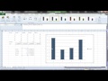
different ways in which you can examine the relationship between two different variables now if you wanted to visualize
this you could then plug these percentages into something like a bar chart or a pie chart um Microsoft Excel
can actually build these charts for you but they tend to be a lot of work and no matter how much time you put into them
they never seem to look quite as nice as the things that you can get out of something like canva Microsoft
PowerPoint or Google slides and so my recommendation to you when it comes to visualization creating bar charts and
pie charts or any other visualization you might like is to take the percentages you get out of these cross
tabulations and then put them into your presentation software of choice open up a blank pie chart or a blank bar chart
and simply plug the percentages in in a way that makes the most sense to your visualization that is going to be much
easier than what we would normally do inside of my Microsoft Excel which tends to be fiddly and um and even once you've
cleaned it up it never looks quite as professional as some of these other options so I highly recommend that you
explore those options as you build your presentations
Cross tabulation is a method used to analyze the relationship between two variables by creating a table that displays the frequency distribution of the variables. In Excel, this is typically done using a pivot table, which allows users to organize and summarize data effectively.
To create a pivot table for cross tabulation, go to the 'Insert' tab in Excel, select 'Pivot Table', and choose the range of your data. Place the independent variable in the columns and the dependent variable in the rows. Then, drag the dependent variable into the values area to display counts or percentages.
Using percentages in cross tabulation is important because it allows for a clearer comparison between groups, especially when the total counts in each group differ. Percentages provide a standardized way to interpret the data, making it easier to identify trends and relationships.
To change the values in a pivot table from sums to counts, click on the value field in the pivot table, select 'Value Field Settings', and then choose 'Count' instead of 'Sum'. This will update the table to reflect the count of occurrences for the selected variable.
To format a pivot table for better presentation, you can rename column and row headers for clarity, remove unnecessary field headers, and adjust the layout for readability. Additionally, you can toggle off field headers in the 'Pivot Table Analyze' tab to eliminate clutter.
Yes, you can visualize the results of cross tabulation in Excel by creating charts such as bar charts or pie charts. However, it is often recommended to export the percentages into presentation software like PowerPoint or Canva for a more polished look.
Comparing counts in pivot tables focuses on the frequency of occurrences of categorical data, while comparing averages involves numerical data to assess the mean values across different groups. Both methods provide insights into the relationships between variables but serve different analytical purposes.
Heads up!
This summary and transcript were automatically generated using AI with the Free YouTube Transcript Summary Tool by LunaNotes.
Generate a summary for freeRelated Summaries
Mastering Descriptive Statistics in Excel: A Step-by-Step Guide
In this tutorial, learn how to analyze single variables in Microsoft Excel using pivot tables. Discover how to count responses, calculate percentages, and compute averages and medians for effective data analysis.
Mastering Basic Navigation and Data Manipulation in Microsoft Excel for Survey Analysis
In this video, we explore essential navigation and manipulation skills in Microsoft Excel, specifically for analyzing survey data. Learn how to identify rows and columns, manage headers, sort data, and handle different types of survey responses effectively.

Comprehensive Guide to Data Analysis and Visualization in MS Excel
Explore a complete tutorial on using MS Excel for data analysis and visualization, covering essential features like Power Query, Power Pivot, formulas, conditional formatting, pivot tables, charts, and dashboard creation. Learn data cleaning, transformation, and insightful visualization techniques from basics to advanced level.

Master Excel for Data Analysis: From Basics to Interactive Dashboards
Learn Microsoft Excel for data analysis starting from the basics to advanced features like formulas, pivot tables, and Power Query. This comprehensive guide covers data cleaning, dynamic filtering, advanced lookup functions, and building interactive dashboards for real-world business insights.
How to Calculate Mean, Standard Deviation, and Create Charts in Excel
Learn step-by-step how to calculate the mean and standard deviation for behavioral data in Excel and create clear, informative charts with error bars. This guide simplifies data analysis and visualization for better understanding and presentation of your results.
Most Viewed Summaries

A Comprehensive Guide to Using Stable Diffusion Forge UI
Explore the Stable Diffusion Forge UI, customizable settings, models, and more to enhance your image generation experience.

Kolonyalismo at Imperyalismo: Ang Kasaysayan ng Pagsakop sa Pilipinas
Tuklasin ang kasaysayan ng kolonyalismo at imperyalismo sa Pilipinas sa pamamagitan ni Ferdinand Magellan.

Mastering Inpainting with Stable Diffusion: Fix Mistakes and Enhance Your Images
Learn to fix mistakes and enhance images with Stable Diffusion's inpainting features effectively.

Pamamaraan at Patakarang Kolonyal ng mga Espanyol sa Pilipinas
Tuklasin ang mga pamamaraan at patakaran ng mga Espanyol sa Pilipinas, at ang epekto nito sa mga Pilipino.

How to Install and Configure Forge: A New Stable Diffusion Web UI
Learn to install and configure the new Forge web UI for Stable Diffusion, with tips on models and settings.

If you found this summary useful, consider buying us a coffee. It would help us a lot!