14 Essential Tips for Mastering Power BI Matrix Customization
Introduction
In this video, we explore 14 powerful tips for customizing the Power BI matrix, including how to adjust styles, alignments, and subtotals. Learn how to enhance your data presentation and make your reports more visually appealing and functional.
Key Tips for Customizing the Power BI Matrix
- Choosing a Theme: Start by selecting a visually appealing theme for your matrix to improve its overall look.
- Adjusting Text Size: Quickly change the text size for various elements in the matrix using the text size settings.
- Alignment Options: Utilize alignment settings to center or right-align headers and values for better readability.
- Fixed Column Size: Prevent automatic resizing of columns to maintain a consistent layout.
- Row Headers with Plus/Minus: Enable the plus/minus feature for row headers to allow for easy expansion and collapse of data.
- Step Layout: Use the step layout feature to display categories in columns instead of rows for better organization.
- Displaying Measures as Rows: Change the display of measures to rows instead of columns for a different perspective on your data.
- Banded Rows Style: Adjust the banded rows style to create a cleaner look by removing alternating row colors.
- Managing Subtotals and Grand Totals: Learn how to toggle subtotals and grand totals on and off, and customize their display. For more on managing data effectively, check out our summary on Mastering Descriptive Statistics in Excel: A Step-by-Step Guide.
- Field Formatting: Change the formatting of individual fields, including number formats and colors, for better clarity. If you're looking to enhance your skills in data manipulation, consider our guide on Mastering Basic Navigation and Data Manipulation in Microsoft Excel for Survey Analysis.
- Conditional Formatting: Apply conditional formatting to highlight important data points based on specific criteria. This technique is also useful in Analyzing Data with Cross Tabulation in Microsoft Excel.
- Dynamic Column Subtotals: Understand that column subtotals only appear when columns are present in the matrix.
- Resetting Settings: Quickly reset all settings to default for a fresh start when needed.
- Final Adjustments: Make final adjustments to ensure your matrix is both functional and visually appealing.
Conclusion
These tips will help you unlock the full potential of the Power BI matrix, allowing you to create more effective and visually appealing reports. If you have any questions or need further assistance, feel free to reach out. Enjoy your Power BI journey!
so hello everybody how are you today into this power VA video we are going to talk about the matrix I'm going to show
you 14 things that you probably wanted to do with the matrix but I think you didn't know it was possible or you
couldn't find it so let's see we can master this thing once overall ok guys so welcome back this is
what we're going to do we're going to talk about how to customize a matrix easy how to bring or remove total
subtotals how to have a step layout like you know rows in column how to put values in column we're going to do
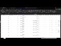
everything ok so 14 things so let's get started we're going to start with this tiny here's thing here we have a matrix
it has on the Rose product naming category name and then we have its we measure sales previous year sales and
you over your sales and there you know the out-of-the-box matrix looks like Excel not very pretty is not helping me
you know beauties and their eyes of the beholder but your mapping is not very pretty but you know if you have to
modify everything yourself takes a long time but if you go here to style the power Betty must produce some like
themes for matrix and for example a mini-mall I think is quite pretty you see it gives modern look of a table and
you just click in there and then you're good to go is super super easy another thing that you probably want to do is
for example change the text size and what happens you have it takes the size to change in the matrix after genuine
columns on rows on values and those subtotals and totals which is not so how do you do that quickly you go here the
text this is search and then it will appear all of the places where you can change the text height and then you can
just you know column headers 13 row headers 13 that didn't change the routine you see right so it starts
changing everything at once without actually having to go through opening everything and closing everything and
all that stuff another tip that I'm going to show you I didn't know one of my quick tip videos now that you have
all this open you want to close everything on reset everything just close this thing and then close baby I'm
going to open it again open and then it will reset okay easy now another common thing that you
probably want to do is alignment so things are aligned like in Excel but the pinyin way you're trained to do lying
way this is like mint so you see it will show you all the alignments of the possibilities they offer like me which
is actually very good so you don't forget and then here you can go for the headers if you want to Center them and
then for the row headers this one maybe let's say that you want to put them to the right for example and then for the
fields you have here you have to do column by column you can see here sales center and then you have to go to
previous year centered you see any centering and so on is over it so it takes a little bit of high in but it is
faster than if you have to you know just go through each one of the settings one by one and then again close this thing
can you please close I'm gonna open it and then boom you get reset everything okay now the next thing I'm gonna show
you is you know sometimes more often than not you have a space dedicated for your matrix and as you're putting things
in there it out Assizes so you know it just doesn't look very pretty so here in column headers you have actually the
possibility to say don't notice eyes I pick the size of you and then don't change it
it doesn't very often and it tends to be annoying so there's a nice trick the next one is on the row headers the pass
- right about you it took me a long time to get used to it because with me plus minus value I thought it was having
values it's always looked for it I'm buddies but it is some rows so you put a plus on a road so it is in here row
headers really have it plus - I wish it was turned on by default but it is no so we have to turn it on every time you can
put it on your theme obviously but a lot of us have the pivots anyhow next one here on row headers as you can see I
have a hierarchy here yeah product name I think category appropriate out the other way but if I want to have the
category that is below you see here on column instead of below and drill down would you need to do is to go to step
layout off and then you will appear you will appear only if you have expanded the rows and that was highly confusing
for me in the beginning because I would say I would read an instruction it's just like turn off a step layout and
then nothing happen but it's because you have to click on here and expand everything and when you expand it if we
get them columns instead of rows ok so that is why nothing happens when you click on step layout okay the next one
is I have my theories I don't forget anything let's see values to values let me go to
values there is an option and this is probably not very common but it is you have the option to put these measures as
if rows instead of columns let me show you if you go here put show on rows you see they like it
um pivots the table puts it on Rose it could be very useful actually in some cases not such a bad
setting this banded rows style with basically means is you know like the default you have a one color for each
row so if you wanna offer every other row so if you want to remove that you do it here no we have a minimalistic layout
so that doesn't have banded rows that's where you can't see it okay so now let's talk about where you're probably are
waiting for in these subtotals and grand totals as you can see here for each row we get a total and then we get a final
total and you would expect that there will be a turn on subtitles and turn all off Grand Hotel's but it's not there's
only a turn on subtotal why because for power bi technically a grand total is a subtotal and I we have the power grid
here were actually depreciated from both and even if it is not technically for any human being on this planet that is a
grand total put it on grand totals put in that aside now that we know that everything is a subtitle if you wanna
get rid of both did you just get rid of them uh known as you can see here there are no totals and no so totals that
there is clean good I say like okay right but I want to have only this up the grand total like the canto so you
have to go here no you have to turn this on first and then you have the total and you say when
I open here I don't want to see these subtitles you have to go here to payroll level and then you have to turn it all
off on product name because this is the subtotal for product so you have to turn it over there and then if you get rid of
them but you still keep the total you see down there okay if you would have to the other way around well
you keep product name you get rid of the category name because the total there is it a little for a category that's why
they call it subtotals because it's a subtotal category right this is a total for each category name so nowadays let's
turn that thing on again you can actually change these and then you can put total for a category and then it
would change that I mean you can do it for the subtitles too which is quite nice
something else that you can do you can change this to the top or at the bottom and that will work also under sub
categories you will go up and down depending on where you're trying to do yes sometimes you wanna you won't have
it on the top really real or not so that's nice I think we've done all the software just let me know you still have
questions about any of the settings something else that I want to show you show you two more things is the field
formatting so you have the possibility to change for every of the column column we are have one more thing that I cannot
forget but we do it at the end so feel free man and you have the possibility to change to these columns and I'll explain
you what worried me with column so dig in say for example I want to have thousands you see that it changes the
thousands now alignment Center you see that it didn't change is because the apply to total for whatever reason is
always all everything is on but not photos anyhow you put thousand in there and then if you want to change for the
previous year to do exactly the same thing put it in there and then you say I 1000 and I want it pink
why not where's the pink there is big hmm and then you can shape to say okay I also want the Heather pink and I want to
apply two values subtotals and totals okay so you have quite a nice granularity as to what do you want to
achieve and the conditional formatting it is conditional formatting it gives you greater clarity about how do you
want to condition for my stuff so for example every year I have to date a virus in there and you see them you have
the possibility to have fun color background color you have the new icons PC them in there right
so now buddy why did I say columns here's the thing let me go back to subtotals if you go here to subtotals
you see that there is row subtotals where it's not columns subtotals you can't see them anywhere and you probably
wonder why if you wanna you know get the totals not only here but only slit here let me show you it is because these
matrix has no columns in there so if I would put a column let's say that I would category name two columns and then
I go back that drove me nuts or boys enough category so pairs I can wait for it subtitles there you have it
column subtitles so this is dynamic if you're not allowed to change it it doesn't show okay so those are my top
tips if you still have questions about the matrix let me know and I will try to find out it is possible and do another
video okay but hopefully this allows you to do the most essential things on the matrix the things that you probably I
wanted to do or try to do but couldn't so this is all for me have a great day enjoy your week stay home stay safe and
we'll see you again on the next video until then take care
Customizing the Power BI matrix enhances data presentation, improves readability, and allows for a more visually appealing report. It helps users to better organize and interpret data, making reports more functional and engaging.
You can quickly change the text size for various elements in the matrix by accessing the text size settings within the Power BI interface. This allows you to adjust the size to improve readability and fit your design preferences.
The plus/minus feature for row headers allows users to easily expand or collapse data categories. This makes it simpler to navigate through large datasets and focus on specific information without overwhelming the viewer.
To apply conditional formatting in Power BI, select the matrix visual, go to the formatting pane, and choose the conditional formatting option. You can set specific criteria to highlight important data points, which helps draw attention to key insights.
Yes, you can quickly reset all settings to default in the Power BI matrix. This feature is useful if you want to start fresh or if your current settings are not yielding the desired results.
The step layout feature allows you to display categories in columns instead of rows, which can help organize data more effectively. This layout can improve the overall structure of your report and make it easier for viewers to follow.
You can toggle subtotals and grand totals on and off in the Power BI matrix settings. Additionally, you can customize their display to fit your reporting needs, ensuring that the totals are clear and informative.
Heads up!
This summary and transcript were automatically generated using AI with the Free YouTube Transcript Summary Tool by LunaNotes.
Generate a summary for freeRelated Summaries

Master Excel for Data Analysis: From Basics to Interactive Dashboards
Learn Microsoft Excel for data analysis starting from the basics to advanced features like formulas, pivot tables, and Power Query. This comprehensive guide covers data cleaning, dynamic filtering, advanced lookup functions, and building interactive dashboards for real-world business insights.

Comprehensive Guide to Data Analysis and Visualization in MS Excel
Explore a complete tutorial on using MS Excel for data analysis and visualization, covering essential features like Power Query, Power Pivot, formulas, conditional formatting, pivot tables, charts, and dashboard creation. Learn data cleaning, transformation, and insightful visualization techniques from basics to advanced level.
Mastering Basic Navigation and Data Manipulation in Microsoft Excel for Survey Analysis
In this video, we explore essential navigation and manipulation skills in Microsoft Excel, specifically for analyzing survey data. Learn how to identify rows and columns, manage headers, sort data, and handle different types of survey responses effectively.

Master Tableau: Comprehensive Guide to Data Visualization & Dashboards
This extensive Tableau course covers everything from basics to advanced topics, including data modeling, calculations, chart types, dashboards, and real-world project implementation. Learn to create dynamic, interactive visualizations and dashboards with over 60 functions and 63 chart types, optimized for business intelligence and data analysis.
Mastering Descriptive Statistics in Excel: A Step-by-Step Guide
In this tutorial, learn how to analyze single variables in Microsoft Excel using pivot tables. Discover how to count responses, calculate percentages, and compute averages and medians for effective data analysis.
Most Viewed Summaries

A Comprehensive Guide to Using Stable Diffusion Forge UI
Explore the Stable Diffusion Forge UI, customizable settings, models, and more to enhance your image generation experience.

Kolonyalismo at Imperyalismo: Ang Kasaysayan ng Pagsakop sa Pilipinas
Tuklasin ang kasaysayan ng kolonyalismo at imperyalismo sa Pilipinas sa pamamagitan ni Ferdinand Magellan.

Mastering Inpainting with Stable Diffusion: Fix Mistakes and Enhance Your Images
Learn to fix mistakes and enhance images with Stable Diffusion's inpainting features effectively.

Pamamaraan at Patakarang Kolonyal ng mga Espanyol sa Pilipinas
Tuklasin ang mga pamamaraan at patakaran ng mga Espanyol sa Pilipinas, at ang epekto nito sa mga Pilipino.

How to Install and Configure Forge: A New Stable Diffusion Web UI
Learn to install and configure the new Forge web UI for Stable Diffusion, with tips on models and settings.

If you found this summary useful, consider buying us a coffee. It would help us a lot!